Autocomplete
Also called autosuggest
Build user-friendly autocomplete with search suggestions, keyboard navigation, and accessibility features.
Overview
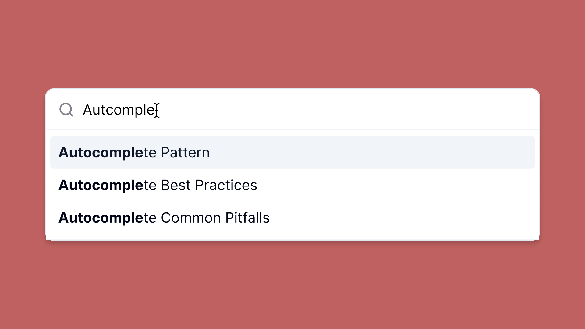
Autocomplete helps users quickly find and select values from predefined options as they type.
Autocomplete combines text input flexibility with dropdown-style selection, providing real-time suggestions matching user input. This pattern reduces errors, speeds data entry, and improves form completion.
Requires live filtering, real-time suggestion updates, keyboard navigation, and screen reader compatibility using ARIA attributes.
Use Cases
When to use:
- Users select from large sets of predefined options (country selection, airport codes)
- Users need faster option selection than scrolling through long dropdowns
- Reducing errors by guiding users to valid input options
- Input has finite, known valid responses
- Combining free text input with suggestion functionality
When not to use:
- Fewer than 10 options exist (use standard dropdown/select instead)
- Users enter completely free-form text without restrictions
- All options need simultaneous visibility for comparison
- Network latency significantly delays suggestion results
- Input field requires exact, verbatim text entry (passwords)
Common scenarios and examples
- Product search in e-commerce catalogs
- City name entry for travel or weather applications
- User or contact lookup in messaging or collaboration tools
Compare Alternatives
Best for: users need complete freedom in their input without suggestions
Best for: users need to select multiple items from a predefined list
Best for: users need to select dates with calendar visualization
Benefits
- Faster data entry through real-time option narrowing
- Less user frustration with guided valid options
- Fewer mistakes and typos using confirmed suggestions from lists
Drawbacks
- Accessibility challenges – Needs proper ARIA attributes (
aria-expanded,aria-controls,aria-activedescendant) for screen readers - Keyboard navigation complexity – Users navigate suggestions with arrow keys and select with Enter
- Performance issues – Dynamic suggestion fetching introduces lag without debouncing and caching
- User overwhelm – Too many suggestions or unclear results create cognitive overload
- Implementation effort – Must handle filtering logic and suggestion visibility management
Anatomy
Component Structure
Loading diagram...
- Container
- Wraps entire autocomplete area including input and dropdown
- Handles positioning, sizing, and floating layers for suggestions
- Input
- Text field for user queries
- Gives real-time updates and triggers suggestion fetching
- Label
- Optional label describing input purpose
- Clarifies for screen readers and provides visible context
- Clear Button
- Quick input field clearing
- Usually shows as "X" or "✕" icon
Best Practices
Content
Do's ✅
- Provide a descriptive label that indicates the purpose of the Autocomplete field
- Use placeholder text to show example input (e.g., "Start typing a country...")
Don'ts ❌
- Don't rely on placeholder text as a replacement for a label
- Don't make your suggestions so vague that it's unclear what the user is selecting
Accessibility
Do's ✅
- Use
aria-controls,aria-autocomplete, and other relevant ARIA attributes to help screen readers - Include a visually hidden label or descriptive text if you rely on an icon-only clear button
- Add a debounce delay to the input field to avoid triggering a fetch request too often
Don'ts ❌
- Don't remove focus outlines without providing alternative focus indicators
- Don't assume all users can use a mouse; ensure keyboard navigation works properly
Visual Design
Do's ✅
- Keep the suggestion list clearly delineated, with sufficient contrast and spacing
- Highlight hovered or focused suggestion items with a distinct visual state
Don'ts ❌
- Don't display an overly large list of suggestions (limit it to a reasonable number), use a scroll bar to allow users to scroll through the list.
- Don't create a cluttered or confusing interface by mixing too many design elements
Layout & Positioning
Do's ✅
- Position the dropdown list immediately below the input field
- Ensure suggestions list appears in front of other page elements when open
Don'ts ❌
- Don't hide the list behind overlays or modals
- Don't move the dropdown to a completely different area away from the input
Code Examples
Basic Implementation
<!-- Basic Autocomplete Markup -->
<div>
  <label for="autocompleteInput">Search for an option</label>
  <input
    type="text"
    id="autocompleteInput"
    name="autocompleteInput"
    aria-autocomplete="list"
    aria-controls="suggestions-list"
    autocomplete="off"
    placeholder="Type to search..."
  />
  <button type="button" aria-label="Clear input">✕</button>
  <ul id="suggestions-list" role="listbox">
    <!-- Dynamically generated suggestions go here -->
  </ul>
</div>
Design Tokens
These design tokens follow the Design Tokens Format specification and can be used with various token transformation tools to generate platform-specific variables.
Autocomplete Tokens in DTF Format
{
  "$schema": "https://design-tokens.org/schema.json",
  "Autocomplete": {
    "container": {
      "borderRadius": {
        "value": "0.25rem",
        "type": "dimension"
      },
      "background": {
        "value": "{color.white}",
        "type": "color"
      }
    },
    "input": {
      "fontSize": {
        "value": "1rem",
        "type": "dimension"
      },
      "padding": {
        "value": "0.5rem",
        "type": "dimension"
      }
    },
    "suggestionsList": {
      "maxHeight": {
        "value": "200px",
        "type": "dimension"
      },
      "background": {
        "value": "{color.gray.50}",
        "type": "color"
      },
      "itemHoverBg": {
        "value": "{color.gray.100}",
        "type": "color"
      }
    }
  }
}
Frequently Asked Questions
- What is autocomplete in web design?
Autocomplete is a user interface feature that predicts and displays suggestions as a user types into an input field, helping them complete their input more efficiently.
- When should I use autocomplete?
Autocomplete is beneficial when users need to input data that can be predicted or matched from a known set of options, such as search queries, addresses, or product names.
- How can I make an autocomplete feature accessible?
Ensure the input field is focusable and supports keyboard navigation. Use ARIA roles and properties like
aria-autocompleteandaria-expandedto convey the state to assistive technologies.
- What are the benefits of using autocomplete?
Autocomplete enhances user experience by reducing typing effort, minimizing errors, and providing faster access to relevant information.
- What are common mistakes to avoid when implementing autocomplete?
Avoid overwhelming users with too many suggestions, neglecting accessibility considerations, and providing irrelevant or poorly ranked suggestions.
Related Patterns
Resources
Articles
- 9 UX Best Practice Design Patterns for Autocomplete Suggestions by Baymard Institute
- Best Practices: Designing autosuggest experiences
Documentation
How is this guide?