Back to Top
Implement a Back to Top button for enhanced navigation on long pages with best practices for placement and accessibility.
Overview
Back to Top gives users a quick way back to the page top after scrolling through lengthy or infinite content.
This floating button or link typically sits at the bottom-right corner, improving navigation and user experience.
Uses a simple anchor link or JavaScript scroll function. Requires smooth scrolling and proper visibility toggling.
Use Cases
When to use:
Use Back to Top to help users quickly return to long page tops without excessive scrolling.
Common scenarios include:
- Long or content-heavy pages where users scroll far down
- Quick navigation back to headers or navigation menus is essential
- Blogs, documentation pages, or e-commerce category listings need extensive scrolling
When not to use:
- Very short pages with minimal or unnecessary scrolling
- Your layout already has persistent bottom navigation or sticky top menus
- Pages without infinite scrolling where scrolling isn't an issue
Common scenarios and examples
- Long editorial content (articles, guides, and blog posts)
- Content hubs or portals with extensive listings
- FAQ pages with collapsible or expanded sections
- Dashboards or analytics pages containing large data tables
- Infinite scrolling experiences (e.g., social feeds) to let users quickly jump to the top
Compare Alternatives
Best for: content should load continuously without user action
Best for: users need to navigate through discrete pages of content
Best for: showing hierarchical navigation path
Benefits
- Better navigation and usability on long pages
- Improved site accessibility with direct routes to main navigation
- Less scrolling fatigue for mobile users
- Clean UI that hides controls until needed, showing them after scrolling
Drawbacks
- Not always necessary – Short pages make the button redundant
- Can be disruptive – Sudden jumps to top disorient users
- Visibility control – Needs logic to appear after certain scroll depth
- Hidden functionality risk – Users might not notice or understand it
- Placement conflicts – Interferes with other floating UI elements without careful positioning
Anatomy
Loading diagram...
Component Structure
- Container
- Clickable element (usually button) triggering scroll to top
- Positioned as floating element on desktop and mobile
- Handles focus states and accessibility attributes
- Icon (Optional)
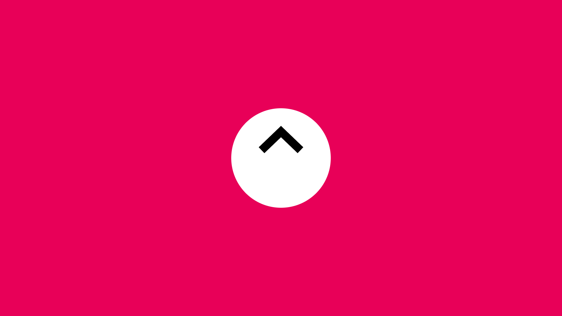
- Shows the go-to-top action (up arrow)
- Clear and universally recognized
- Sized for readability (16×16px or 24×24px common)
- Contrasts with background
- Label Text (Optional)
- Clarifies action for screen readers or when icon alone doesn't work
- Hidden for visual users but available to assistive technology
- Visible when design needs extra clarity
- Visual States
- Default: Visible when the user scrolls past a certain threshold
- Hover: Provides a visual cue (e.g. change in background color)
- Active: Pressed or clicked state
- Focus: Outline or highlight for keyboard navigation
- Hidden: Button is invisible or removed when the user is near the top of the page
Summary of Components
| Component | Required? | Purpose |
|---|---|---|
| Container | ✅ Yes | Clickable element that triggers scrolling to the top. |
| Icon | ❌ No | Visual indicator (e.g., an up arrow) for quick recognition. |
| Label Text | ❌ No | Provides additional clarity, especially for screen readers. |
| Visual States | ✅ Yes | Defines interaction states (hover, active, focus, hidden). |
Variations
1. Fixed Position Button
The most common implementation - a button that remains in a fixed position (typically bottom-right) as the user scrolls.
When to use: Standard long-form content pages, articles, documentation
2. Sticky Footer Integration
Integrated into a sticky footer bar that may also contain other navigation elements.
When to use: When you have a persistent footer with multiple actions
3. Progress Indicator Combo
Combined with a scroll progress indicator that shows how far down the page the user has scrolled.
When to use: Long articles or tutorials where progress tracking is valuable
4. Expandable FAB (Floating Action Button)
A floating action button that expands to reveal multiple navigation options including "Back to Top".
When to use: Mobile apps or sites with multiple quick actions
5. Sidebar Integration
Embedded within a sticky sidebar navigation alongside other page navigation elements.
When to use: Documentation sites or content with extensive navigation needs
6. Contextual Appearance
Appears only within specific long sections rather than globally on the page.
When to use: Pages with distinct long sections that benefit from section-specific navigation
Examples
Interactive Back to Top Demo
Loading code editor...
This example showcases:
- Smooth scroll animation to top
- Button appears after scrolling 300px
- Fade-in/out transitions for button visibility
- Progress bar showing scroll position
- Throttled scroll events for performance
- Keyboard support (Tab to focus, Enter/Space to activate)
- Respects
prefers-reduced-motionfor accessibility - Mobile-optimized touch targets
Basic Implementation (HTML + minimal JS)
<button type="button" class="js-back-to-top" aria-label="Back to top" hidden>
  ↑
</button>

<script>
  // Basic scroll logic
  const backToTopBtn = document.querySelector(".js-back-to-top");
  const scrollThreshold = 300; // in px

  function toggleBackToTop() {
    if (window.scrollY > scrollThreshold) {
      backToTopBtn.removeAttribute("hidden");
    } else {
      backToTopBtn.setAttribute("hidden", "");
    }
  }

  function scrollToTop() {
    window.scrollTo({ top: 0, behavior: "smooth" });
  }

  document.addEventListener("scroll", toggleBackToTop);
  backToTopBtn.addEventListener("click", scrollToTop);
</script>
React Implementation with Hooks
import { useState, useEffect } from 'react';

function BackToTop() {
  const [isVisible, setIsVisible] = useState(false);

  useEffect(() => {
    const toggleVisibility = () => {
      setIsVisible(window.scrollY > 300);
    };

    window.addEventListener('scroll', toggleVisibility);
    return () => window.removeEventListener('scroll', toggleVisibility);
  }, []);

  const scrollToTop = () => {
    window.scrollTo({
      top: 0,
      behavior: 'smooth'
    });
  };

  return isVisible ? (
    <button
      onClick={scrollToTop}
      className="back-to-top"
      aria-label="Back to top"
    >
      ↑
    </button>
  ) : null;
}
CSS Styling
.back-to-top {
  position: fixed;
  bottom: 2rem;
  right: 2rem;
  width: 3rem;
  height: 3rem;
  border-radius: 50%;
  background-color: #007bff;
  color: white;
  border: none;
  cursor: pointer;
  opacity: 0.9;
  transition: opacity 0.3s, transform 0.3s;
  z-index: 1000;
}

.back-to-top:hover {
  opacity: 1;
  transform: translateY(-4px);
}

.back-to-top:focus {
  outline: 2px solid #0056b3;
  outline-offset: 2px;
}

/* Reduce motion for accessibility */
@media (prefers-reduced-motion: reduce) {
  .back-to-top {
    transition: none;
  }

  * {
    scroll-behavior: auto !important;
  }
}

/* Mobile optimization */
@media (max-width: 768px) {
  .back-to-top {
    bottom: 1rem;
    right: 1rem;
  }
}
Best Practices
Content
Do's ✅
- Show a clear visual indicator (usually an up arrow icon)
- Display the button only after the user scrolls a predetermined distance
- Hide it when the user is near the top of the page
- Use an accessible label (e.g.,
aria-label="Back to top") if the text is omitted
Don'ts ❌
- Don't make it permanently visible for short pages—it can be distracting
- Don't use vague icons or labels (e.g., a random symbol without context)
- Don't crowd the button with other floating elements
- Don't rely solely on color for states—use shape or text changes if possible
Accessibility
Do's ✅
- Ensure the button is keyboard-focusable and can be activated via Enter or Space
- Provide sufficient color contrast between the button and its background
- Use an appropriate aria-label or descriptive text for screen readers
- Manage focus: after scrolling up, keep the user informed or maintain logical focus
Don'ts ❌
- Don't hide it behind complex interactions or animations
- Don't place it in a position that overlaps other important UI elements
- Don't disable focus outlines without providing an alternative focus style
Visual Design
Do's ✅
- Use a large enough icon or label for quick recognition (minimum 16×16px icon)
- Maintain consistent styling with the rest of your UI (color, shape, corners)
- Incorporate hover/focus states that match your design system guidelines
- Place it in a fixed position (often bottom-right) for easy access
Don'ts ❌
- Don't block important content with a floating button
- Don't make the button so small that it's hard to tap on mobile
- Don't use misleading icons (ensure the arrow is pointing up)
Mobile & Touch Considerations
Do's ✅
- Use a minimum touch target of 44×44px
- Keep it within thumb-friendly zones at the bottom of the screen
- Make sure it doesn't overlap interactive elements (navigation drawers, chat bubbles)
- Add any necessary spacing from device edges to avoid accidental swipes
Don'ts ❌
- Don't place it in corners difficult to reach on large screens
- Don't rely on hover states for mobile users—visual changes should appear on tap/press
- Don't crowd the bottom area with too many floating icons
Layout & Positioning
Do's ✅
- Fix its position to the viewport so it remains visible during scrolling
- Use consistent margin or spacing from edges for aesthetic alignment
- Keep in mind other fixed UI elements such as sticky footers or chat widgets
Don'ts ❌
- Don't move it around the page as the user scrolls
- Don't tie it to an element that scrolls out of view
Common Mistakes & Anti-Patterns 🚫
Always Visible on Short Pages
The Problem: Showing the Back to Top button on pages that don't require scrolling or have minimal content creates unnecessary UI clutter.
How to Fix It: Only display the button after the user has scrolled at least 2x the viewport height or a minimum of 1000px.
Jarring Jump Without Animation
The Problem: Instantly jumping to the top without smooth scrolling can disorient users and make them lose context.
How to Fix It:
Implement smooth scrolling with scroll-behavior: smooth or JavaScript animation with appropriate duration (300-500ms).
Poor Button Visibility
The Problem: Using low contrast colors or making the button too small/transparent makes it hard to notice or click.
How to Fix It: Ensure sufficient color contrast (WCAG AA minimum) and use a minimum touch target of 44x44px.
Blocking Important Content
The Problem: Placing the button where it covers important interactive elements like chat widgets or cookie banners.
How to Fix It: Carefully position the button to avoid overlapping with other floating elements, adjusting position dynamically if needed.
Missing Keyboard Support
The Problem: Button only works with mouse/touch, excluding keyboard users from using the feature.
How to Fix It: Ensure the button is keyboard accessible, focusable with Tab, and activatable with Enter/Space keys.
No Visual Feedback on Interaction
The Problem: Button doesn't provide hover, focus, or active states, leaving users uncertain if their interaction registered.
How to Fix It: Implement clear visual states for all interactions including hover, focus, active, and disabled states.
Micro-Interactions & Animations
Button Appearance Animation
- Effect: Fade in with slight scale up
- Timing: 200ms ease-out
- Trigger: When scroll threshold is passed
- Implementation: CSS transition on opacity and transform
Hover State Transition
- Effect: Background color change with subtle shadow elevation
- Timing: 150ms ease-in-out
- Trigger: Mouse hover or focus
- Implementation: CSS :hover and :focus states
Click Feedback
- Effect: Scale down slightly then back to normal
- Timing: 100ms down, 150ms up
- Trigger: Click or tap
- Implementation: CSS :active state with transform: scale(0.95)
Scroll Animation
- Effect: Smooth easing scroll to top
- Timing: 300-500ms depending on scroll distance
- Trigger: Button activation
- Implementation: JavaScript with easing function or CSS scroll-behavior
Progress Indicator (Optional)
- Effect: Circular progress fills as user scrolls down
- Timing: Real-time tracking
- Trigger: Scroll events (throttled)
- Implementation: SVG stroke-dasharray animation
Hide Animation
- Effect: Fade out with slight scale down
- Timing: 200ms ease-in
- Trigger: When user scrolls back near top
- Implementation: CSS transition with visibility toggle
Tracking
Key Events to Track
| Event Name | Description | Why Track It? |
|---|---|---|
back_to_top.shown | Button becomes visible after scroll threshold | Understand if users scroll far enough to see it |
back_to_top.clicked | User clicks/taps the button | Measure actual usage and engagement |
back_to_top.keyboard_activated | Button activated via keyboard | Track accessibility feature usage |
back_to_top.scroll_depth | Maximum scroll depth before using button | Understand when users decide to return |
back_to_top.time_to_use | Time between button appearance and click | Measure decision making time |
Event Payload Structure
{
  "event": "back_to_top.clicked",
  "properties": {
    "page_height": 5000,
    "scroll_depth": 3500,
    "time_on_page": 45,
    "device_type": "mobile",
    "button_position": "bottom-right"
  }
}
Key Metrics to Analyze
- Usage Rate: Percentage of users who see and use the button
- Scroll Depth at Use: Average scroll position when button is clicked
- Time to Engagement: How long users take to click after button appears
- Device Breakdown: Usage patterns across desktop vs mobile
- Page Type Performance: Which content types benefit most from the feature
Insights & Optimization Based on Tracking
By analyzing tracking data, we can optimize the Back to Top experience:
-
📉 Low Usage Rate? → Users might not be scrolling far enough to see the button. Consider lowering the scroll threshold or making the button more visually prominent.
-
⏱️ High Time to Engagement? → Users might be hesitant to use the button. Consider adding a tooltip or making the button more discoverable through visual cues.
-
📱 Mobile vs Desktop Usage Differences? → Mobile users might prefer different positioning or sizing. Test button placement and touch target size for mobile optimization.
-
📊 Low Scroll Depth at Use? → Users might be clicking too early, suggesting the button appears too soon. Consider increasing the scroll threshold.
-
🎯 Page Type Performance Variations? → Some content types might not benefit from the button. Consider removing it from short pages or pages where users don't scroll significantly.
-
🔄 High Keyboard Activation Rate? → Indicates good accessibility implementation. Ensure keyboard users have the same experience as mouse users.
By continuously monitoring these metrics, we can refine the Back to Top button's effectiveness and improve overall user experience.
RTL (Right-to-Left) Considerations
- Position button on bottom-left for RTL languages
- Mirror any directional icons appropriately
- Adjust animation directions for RTL context
Cultural Considerations
- Icon choice: Up arrow is universally understood
- Position: Bottom-right is standard in LTR, bottom-left in RTL
- Color significance: Avoid colors with negative cultural connotations
Localization
The Back to Top component contains several interactive elements that require localization. This includes visible labels for buttons and controls, as well as ARIA labels for screen readers. The following JSON structure provides a comprehensive set of strings that should be translated for each supported language.
Note that for right-to-left (RTL) languages, you may need to adjust the button position from bottom-right to bottom-left accordingly.
{
  "back_to_top": {
    "button": {
      "label": "Back to top",
      "aria_label": "Scroll back to top of page",
      "tooltip": "Return to top"
    },
    "announcements": {
      "scrolling": "Scrolling to top of page",
      "completed": "Reached top of page"
    },
    "progress": {
      "indicator_label": "Scroll progress: {percentage}%"
    }
  }
}
Performance
Performance Metrics
<button type="button" class="js-back-to-top" aria-label="Back to top" hidden>
  ↑
</button>

<script>
  // Basic scroll logic
  const backToTopBtn = document.querySelector(".js-back-to-top");
  const scrollThreshold = 300; // in px

  function toggleBackToTop() {
    if (window.scrollY > scrollThreshold) {
      backToTopBtn.removeAttribute("hidden");
    } else {
      backToTopBtn.setAttribute("hidden", "");
    }
  }

  function scrollToTop() {
    window.scrollTo({ top: 0, behavior: "smooth" });
  }

  document.addEventListener("scroll", toggleBackToTop);
  backToTopBtn.addEventListener("click", scrollToTop);
</script>
React Implementation with Hooks
import { useState, useEffect } from 'react';

function BackToTop() {
  const [isVisible, setIsVisible] = useState(false);

  useEffect(() => {
    const toggleVisibility = () => {
      setIsVisible(window.scrollY > 300);
    };

    window.addEventListener('scroll', toggleVisibility);
    return () => window.removeEventListener('scroll', toggleVisibility);
  }, []);

  const scrollToTop = () => {
    window.scrollTo({
      top: 0,
      behavior: 'smooth'
    });
  };

  return (
    <button
      className={`back-to-top ${isVisible ? 'visible' : ''}`}
      onClick={scrollToTop}
      aria-label="Back to top"
    >
      ↑
    </button>
  );
}
CSS Styling
.back-to-top {
  position: fixed;
  bottom: 1rem;
  right: 1rem;
  width: 2.5rem;
  height: 2.5rem;
  border-radius: 50%;
  background: #333;
  color: white;
  border: none;
  cursor: pointer;
  opacity: 0;
  visibility: hidden;
  transition: opacity 200ms, visibility 200ms;
}

.back-to-top.visible {
  opacity: 1;
  visibility: visible;
}

.back-to-top:hover {
  background: #555;
}

.back-to-top:focus {
  outline: 2px solid #0066cc;
  outline-offset: 2px;
}
Performance
Performance Metrics
Target Metrics:
- Scroll trigger threshold: Show after 2x viewport height (or ~1000px)
- Scroll animation duration: 300-500ms for smooth feel
- Button fade-in: < 200ms transition
- Interaction delay: < 50ms response to click
- Frame rate: Maintain 60fps during scroll animation
Scroll Performance:
- Throttle scroll events: Check position every 100-150ms (not on every scroll)
- Use Intersection Observer: More performant than scroll listeners
- Passive event listeners: Add
{ passive: true }to scroll handlers - RAF for animations: Use requestAnimationFrame for smooth scrolling
Visibility Optimization:
- CSS transitions: Use for show/hide animations (not JavaScript)
- Transform + opacity: Animate these properties for GPU acceleration
- Will-change: Apply sparingly to button during transitions
- Avoid reflows: Don't change layout properties during animations
Mobile Performance:
- Touch responsiveness: < 100ms feedback on tap
- Reduced motion: Respect
prefers-reduced-motionmedia query - Scroll behavior: Use native CSS
scroll-behavior: smoothwhen possible - Battery impact: Minimize continuous animations
Testing Guidelines
Functional Testing
Should ✓
- Show the button after scrolling a set distance
- Smoothly scroll to top when clicked
- Hide the button when the user is near the top
- Maintain correct visible/hidden states on page load and resize
- Prevent overlapping interactions with other floating components
Accessibility Testing
Should ✓
- Have proper ARIA labels for icon-only implementations
- Be operable with keyboard (Enter, Space)
- Maintain a visible focus state when tabbed to
- Provide enough contrast between button and background
- Respect user motion preferences (reduce motion if system preferences are set)
Visual Testing
Should ✓
- Float consistently at the chosen position across different viewport sizes
- Show correct hover, focus, and active states
- Remain unobtrusive yet visible
- Align with other design elements and not overlap key UI components
Performance Testing
Should ✓
- Not introduce layout shifts when appearing or disappearing
- Handle rapid scrolling up/down events effectively
- Support smooth animations without jank
- Remain performant on mobile devices
Browser Support
Performance Metrics
Target Metrics
Response Times:
- Button appearance: < 50ms after scroll threshold
- Hover feedback: < 100ms visual response
- Click to scroll start: < 50ms
- Scroll animation: 300-500ms duration
- Focus outline: Immediate (< 16ms)
Scroll Performance:
- Throttle rate: Check position every 100-150ms
- Frame rate: Maintain 60fps during animations
- Memory usage: < 1MB for button component
- CPU usage: < 5% during scroll monitoring
Animation Performance:
- Use transform/opacity: GPU-accelerated properties only
- Avoid reflows: No layout changes during animations
- Will-change: Apply sparingly, remove after animation
- RequestAnimationFrame: For smooth scroll implementations
Mobile Optimization:
- Touch response: < 100ms feedback
- Gesture recognition: Support swipe-to-top on iOS
- Battery impact: Minimal with throttled events
- Reduced motion: Respect user preferences
SEO Considerations
- No direct SEO impact - Back to Top is a UX feature that doesn't affect content indexing
- Indirect benefits: Improved user engagement metrics (time on page, bounce rate)
- Ensure button doesn't hide content from search engine crawlers
- Use semantic HTML (
<button>element) for better accessibility signals - Avoid keyword stuffing in button text or ARIA labels
Design Tokens
These design tokens follow the Design Tokens Format specification and can be used with various token transformation tools to generate platform-specific variables.
Button Tokens in DTF Format
{
  "$schema": "https://design-tokens.org/schema.json",
  "backToTop": {
    "position": {
      "right": { "value": "1rem", "type": "dimension" },
      "bottom": { "value": "1rem", "type": "dimension" }
    },
    "sizing": {
      "width": { "value": "2.5rem", "type": "dimension" },
      "height": { "value": "2.5rem", "type": "dimension" },
      "touchTarget": {
        "value": "2.75rem",
        "type": "dimension",
        "description": "44px minimum touch target"
      }
    },
    "icon": {
      "size": { "value": "1.25rem", "type": "dimension" }
    },
    "border": {
      "radius": { "value": "50%", "type": "dimension" },
      "width": { "value": "0px", "type": "dimension" }
    },
    "colors": {
      "background": {
        "default": { "value": "{color.gray.200}", "type": "color" },
        "hover": { "value": "{color.gray.300}", "type": "color" },
        "active": { "value": "{color.gray.400}", "type": "color" }
      },
      "icon": {
        "default": { "value": "{color.gray.900}", "type": "color" }
      }
    },
    "states": {
      "focusRing": {
        "width": { "value": "2px", "type": "dimension" },
        "offset": { "value": "2px", "type": "dimension" },
        "color": { "value": "{color.primary.200}", "type": "color" }
      }
    }
  }
}
FAQ
- What is a 'Back to Top' button?
A 'Back to Top' button is a user interface element that allows users to quickly return to the top of a webpage without manually scrolling, enhancing navigation on long pages.
- When should I use a 'Back to Top' button?
Implement a 'Back to Top' button on pages that require significant scrolling, typically more than two screens of content. This feature is especially beneficial for mobile users and those with accessibility needs.
- Where should the 'Back to Top' button be placed?
The button is typically positioned in the bottom right corner of the page, where users expect to find it. This placement keeps it accessible yet unobtrusive.
- How can I make a 'Back to Top' button accessible?
Ensure the button is keyboard navigable by using a standard
<button>element, provide a descriptive label like 'Back to Top', and implement visible focus indicators for users navigating via keyboard.
- What are the best practices for designing a 'Back to Top' button?
Use clear labeling, maintain a consistent position, ensure the button is appropriately sized for both desktop and mobile devices, and avoid covering important content. The button should appear after users have scrolled down a significant portion of the page.
Related Patterns
Pagination
Learn best practices for building accessible, user-friendly page navigation with clear guidelines for design and performance.
Infinite scroll
Create seamless content loading with infinite scroll, focusing on performance, accessibility, and user experience best practices.
Load More
Build efficient content loading with the Load More pattern, focusing on user experience and performance optimization.
Breadcrumb
Create effective breadcrumb navigation for better site orientation. Learn implementation techniques, accessibility requirements, and design best practices for clear hierarchical navigation.
Resources
Libraries & Frameworks
React Components
- React Scroll – Scroll components with smooth animations
Vue Components
- Vue Backtotop – Back to top component for Vue.js
- Vue Scroll To – Scrolling to elements with easing
Vanilla JavaScript
- Vanilla Back To Top – Lightweight vanilla JS implementation
- ScrollToTop.js – Smooth scrolling library
Articles
How is this guide?